Crafty Designs – Gustavo Ortega (Hop Nation)
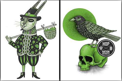
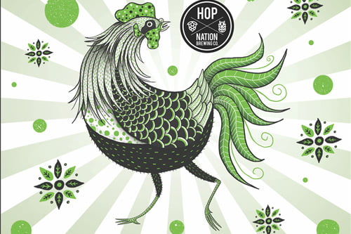
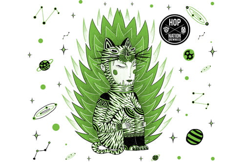
Thanks to their distinct branding Hop Nation’s beers are easy to identify when you stroll up to a chock-full bottle shop fridge. It’s often their paired back white, black and green colour palette that makes them immediately recognisable.
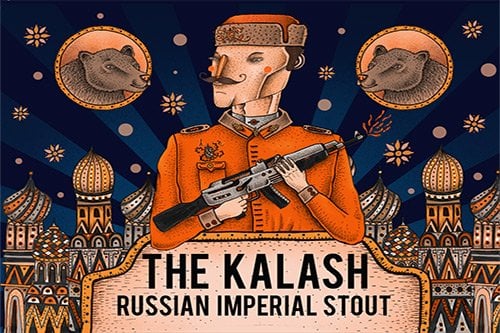
We recently caught up with Gustavo Ortega, one of the talented artists responsible for the cool, playful art on Hop Nation’s Market and Kalash labels.
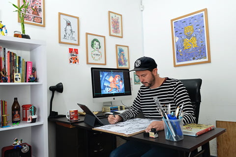
A graphic designer who resides in Bogotá, Colombia, Gustavo’s designs have been published in numerous books and magazines and his clients include Hop Nation, Random House and JWT.
How did you come to work with Sam and Duncan at Hop Nation?
It’s a funny story I used to work with the “Canary Press Short Story Magazine” and Hop Nation provided the beers for one of their launches. That night I was drunk as hell so I don’t remember anything, the next day I found in my pocket a piece of paper that said “Hi it’s Duncan 04******** call me Hop Nation”, so I called him and we started to work together. I created the Kalash label first.
In three words, tell us how you would best describe Hop Nation’s visual identity?
Green, funny and bold.
What’s your favourite beer label that you’ve designed for Hop Nation? And what was the inspiration behind it?
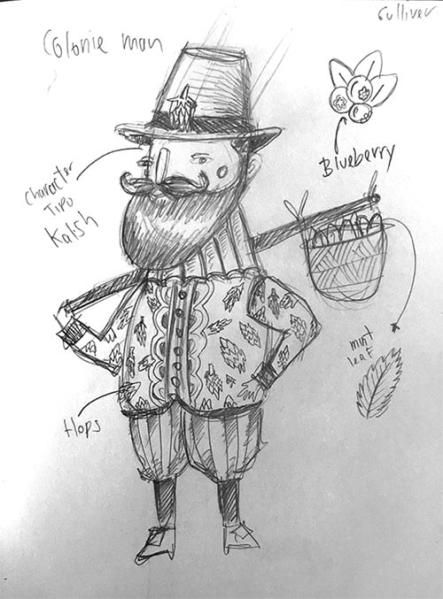
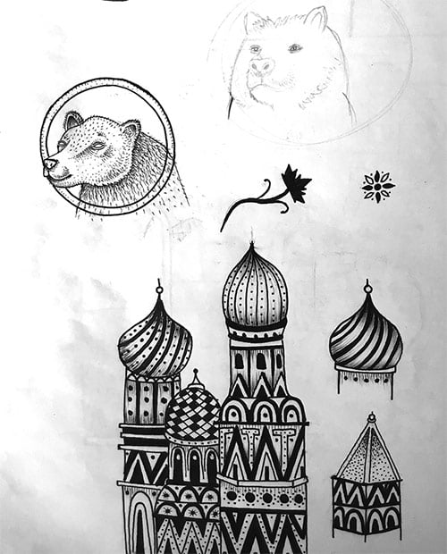
Mmmmmm it’s very difficult to choose just one but I would say that the first one, always it’s going to be special. The inspiration behind The Kalash label was the story behind the Russian Imperial Stout. But my favourites so far are The Kalash, The Dawn and Dreamfeed.
What kinds of challenges do you face when designing for the brewery?
One of the challenges when I work with Hop Nation is that I have to be simple; I can’t use lots of colours or shadings. Just with green, black and white my designs have to stand out and transmit the concept behind the beer.
Are there any other craft beer labels that you admire?
When I was in Australia I drank a lot Kaiju beers, I started buying them just for the label, also I like Mike Keller and Nathan Walker.
Original and creative beer labels are now becoming common in the craft beer community, what is the key to standing out in the fridge?
I think that you have to be honest and enjoy what you’re doing for your client, and I believe that being consistent in the design helps the recognition of the brand and our illustrations, that’s the rule that I follow to stand out in the fridge.
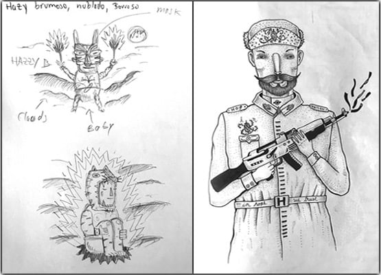
Check out some of Gustavo’s original sketches!